This was an agile 14-week content sprint. I was part of a global team at the Content Design London Academy. And worked on finding usability solutions for the Safe Lives training section.
Challenge
Text-heavy content with lots of jargon, confusing user pathways and an unclear offering. This meant that the training section was missing the mark.
Users were confused about what they wanted and what they were eligible for.
As a result, Safe Lives was spending time dealing with user enquiries on the phone or via email.
Process
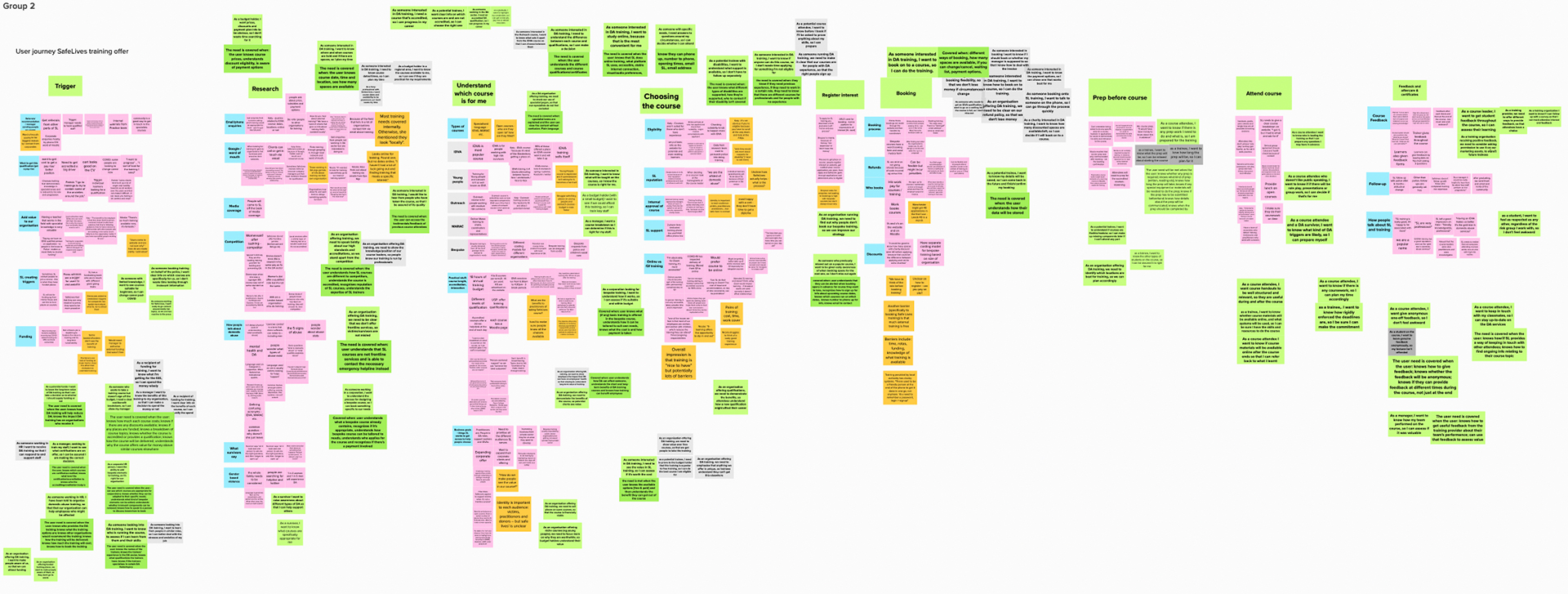
I wrote up user needs, mapped journeys and created acceptance criteria. All while working with my team on Mural.
Sketching solutions and content crits were important. They helped me decide what needed changing right away. Or what needed improvement down the line.
I ran data-driven research to find out what different mental models the client and their audience had. And how they could be bridged.
A key element stood out to me: the benefits of training were clearer to the client than to the user. And in that understanding lay a solution.
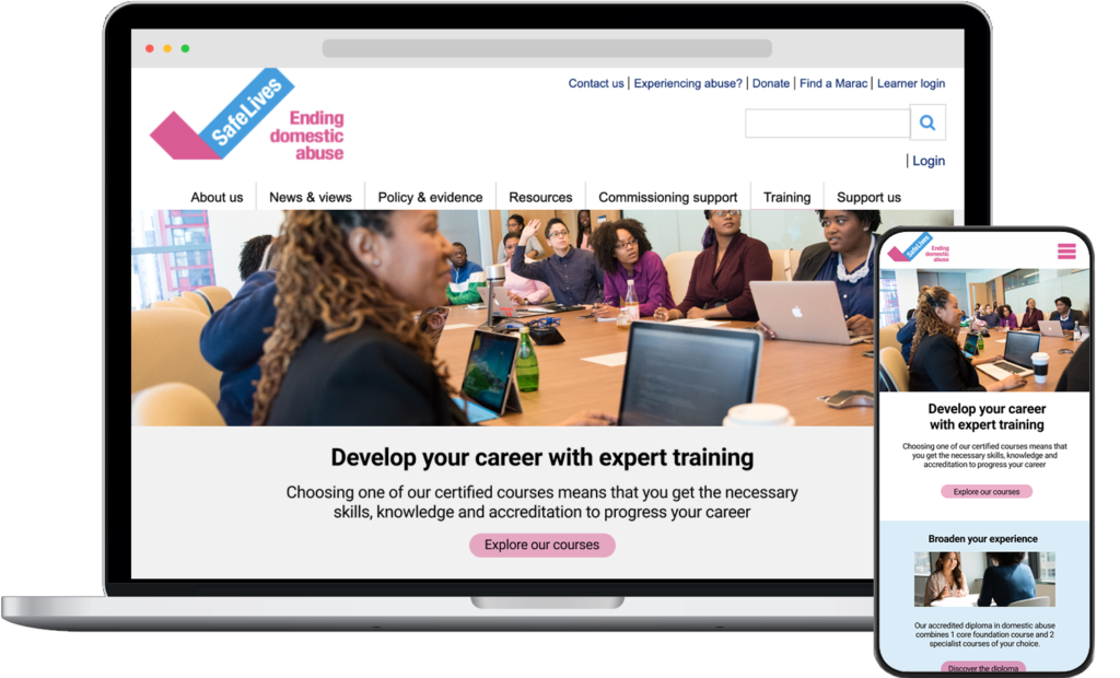
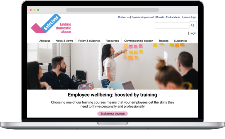
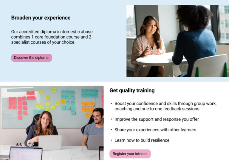
I restructured the messaging hierarchy of 3 training pages with subsections.
Delivered
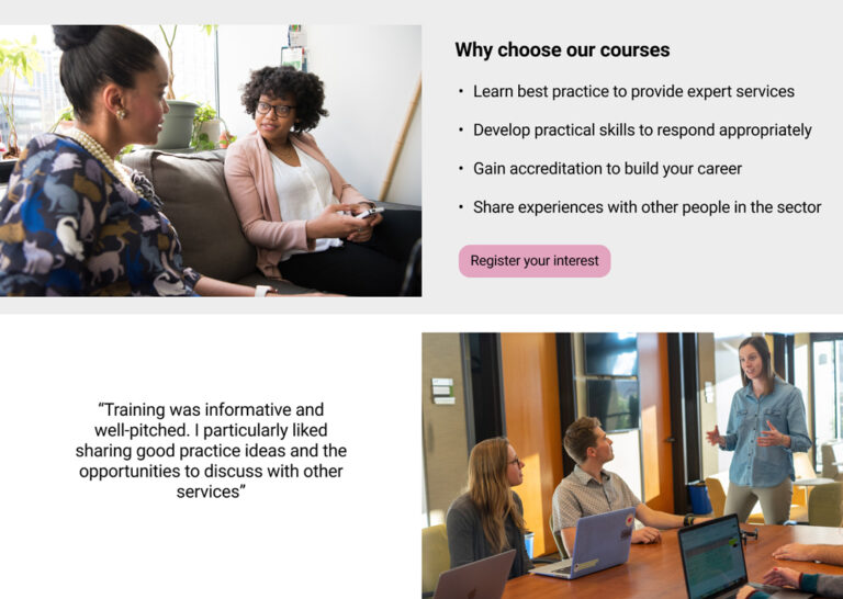
3 product pages each with a new messaging taxonomy so that users understood:
the training benefits offered by the client
how the skills and accreditation could progress their career
why the user should choose the training on offer
Clear content and microcopy for these 3 pages
Prototypes that targeted pain points. And put the user at the center of journey
Acronyms and jargon were scrapped, and I made room for clear terminology instead